UX Gallery

Whenever I use a new product, I love to take a close look at its UI/UX. I like to think about why the Product Manager or Designer chose certain elements and imagine what I might have done differently if I were in their shoes.
Here is a curated gallery of some of the standout (and a few not so great) UI/UX designs I’ve encountered. These examples highlight small yet very functional UX decisions and product choices that make the user experience exceptional.
This is a living list that I continuously update as I encounter new and interesting designs.
1. Github: Deleting a Repository
When the user is trying to make an unrecoverable change, make the confirmation box uncommon.

Github prevents the user from mistakenly deleting a repository by ensuring that he the deletion only happens after the user manually types the name of the repository.
2. Netflix: Skip Intro
Automating the right user flow can dramatically improve user experience.

Netflix provides ‘Skip Intro’ button which allows the viewer to skip the video credits, recap of the previous episode with the click of a button. This allows the viewer to have a smoother transition between two episodes and delivers a seamless binge-watching experience.
3. Microsoft Teams: Lower Hand
Automating repetitive tasks, like lowering hands, reduces the cognitive load on users, allowing them to focus on the primary activities.
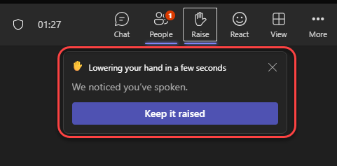
Microsoft Teams detects when a participant has spoken and automatically lowers their raised hand. By automating this workflow, it eliminates the need for the participant to manually lower their hand. It also reduces the cognitive load on meeting organizers by removing the need to keep track of who has spoken.
A great touch is providing users the option to override this feature if required.
4. Myntra: Size Recommendation
Recommendations at the right stage of the user flow can have a huge impact on conversion and customer satisfaction
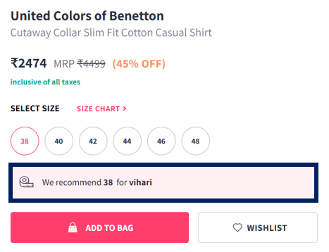
Based on previous purchases, Myntra recommends the best size for the customer. By offering size recommendations at a critical point (just before adding the product to the cart), Myntra reduces uncertainty about the right fit and encourages customers to proceed with confidence. This approach also helps minimize the number of returns and exchanges due to sizing problems.
5. iPod: Click Wheel Navigation
Explore unconventional methods when faced with technological or form factor constraints
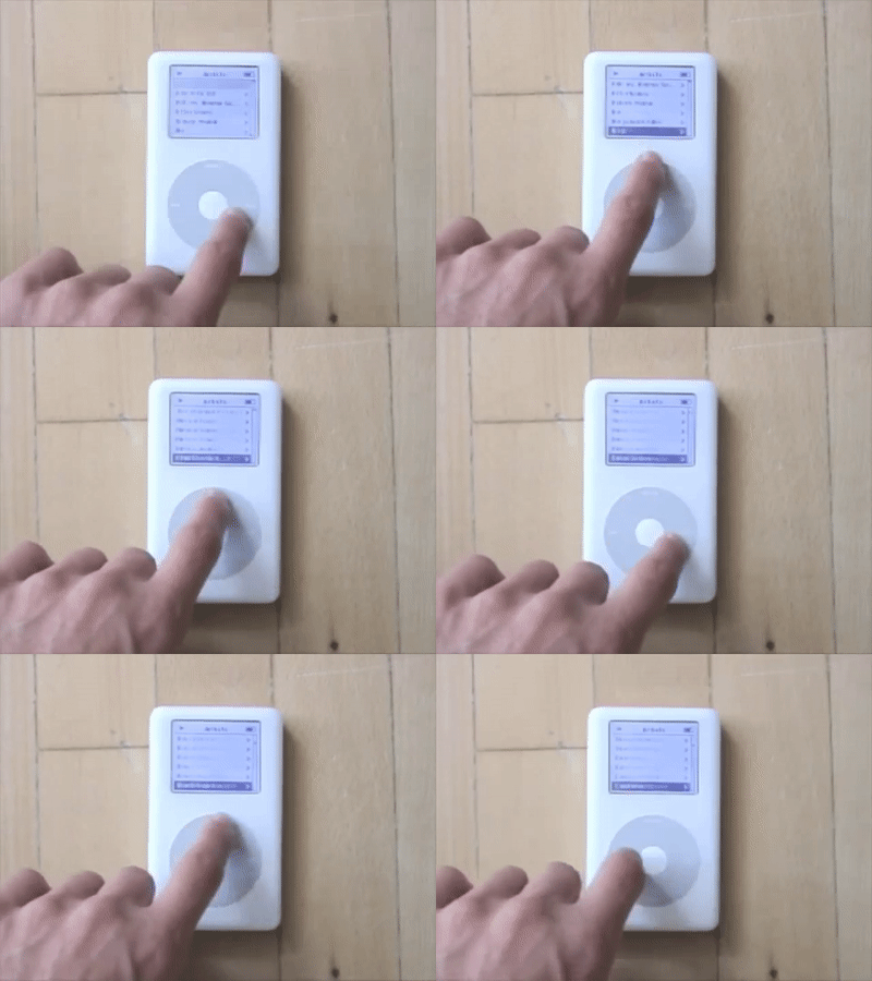
Users could quickly scroll through long lists of songs (up to 1000 songs in your pocket) or menus with the Click Wheel. It made scrolling much more engaging and enjoyable compared to using a typical scroll-down button.
6. Slack: Warning Message
Confirm with the user before performing an event that has significant impact

Slack explicitly explains the consequence of using @channel by quantifying the number of people who will receive the message. This ensures that users are fully aware of the impact and will proceed only if it is strictly necessary.
By providing an easy way to override this warning, Slack ensures that users who intend to send a bulk message can do so, while also preventing accidental messages that could spam everyone in the group.
7. Amazon Prime: Cast Details
Provide information that is directly relevant to the user’s current context, in a way that does not disrupt the primary user experience.
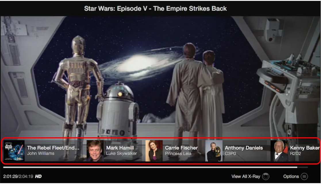
When a user pauses Amazon Prime video, X-Ray pops up. It provides the user information about the cast seen in the frame, soundtrack, and other production details. Amazon elegantly incorporates this feature without being intrusive and detracting from the primary user experience, watching the video.
It also minimises the need for user to leave the platform or use external services/tools to find the information they need.
8. Gmail: No files attached
Anticipate common user errors and design features that prevent them before they occur.
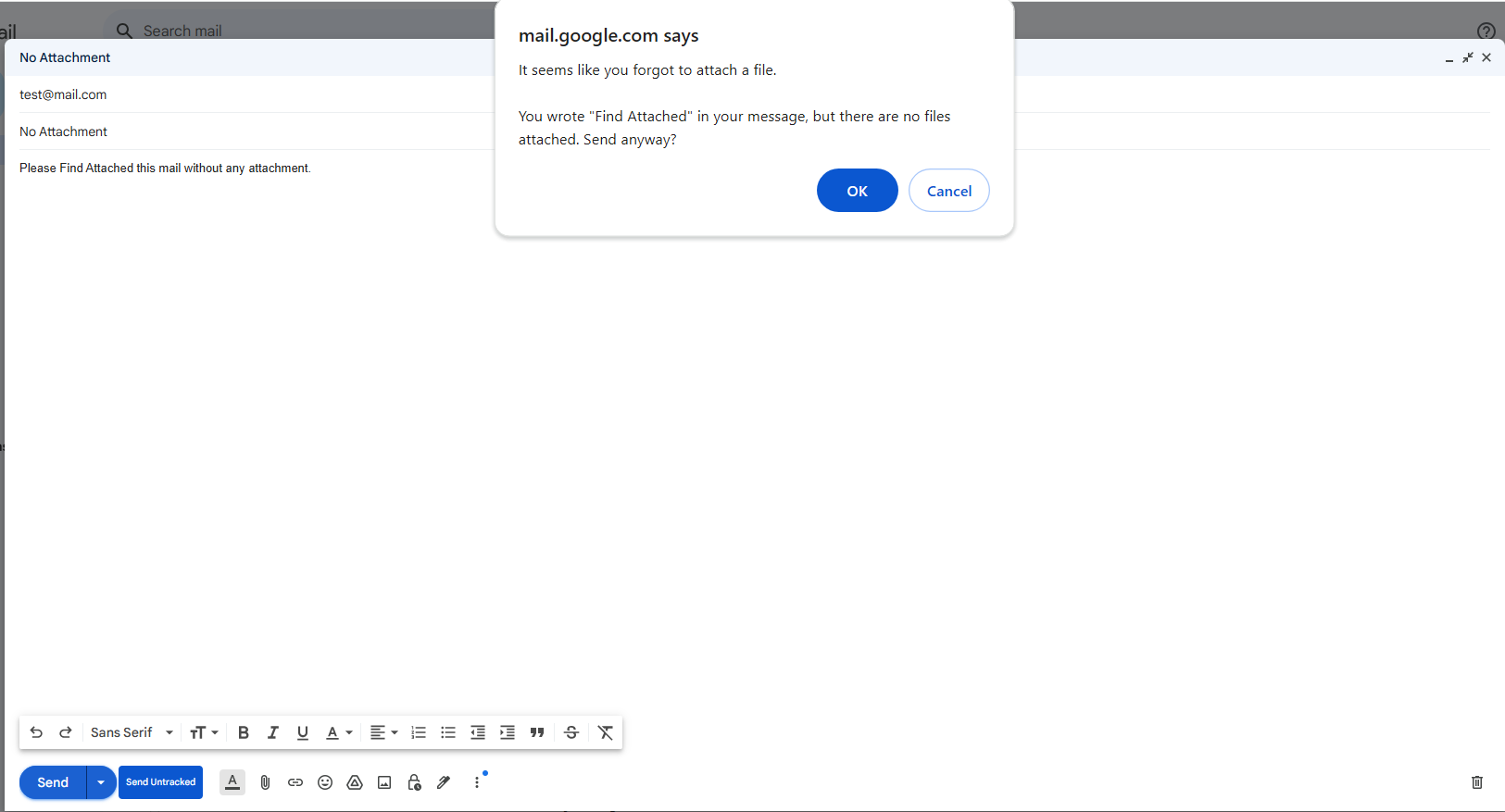
When user composese a email and mention an attachment but forget to actually attach a file, Gmail will display a warning message. This feature helps prevent a common user error and improves the overall user experience.
###